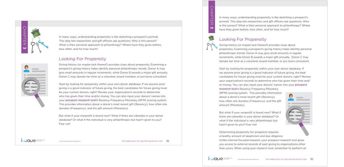
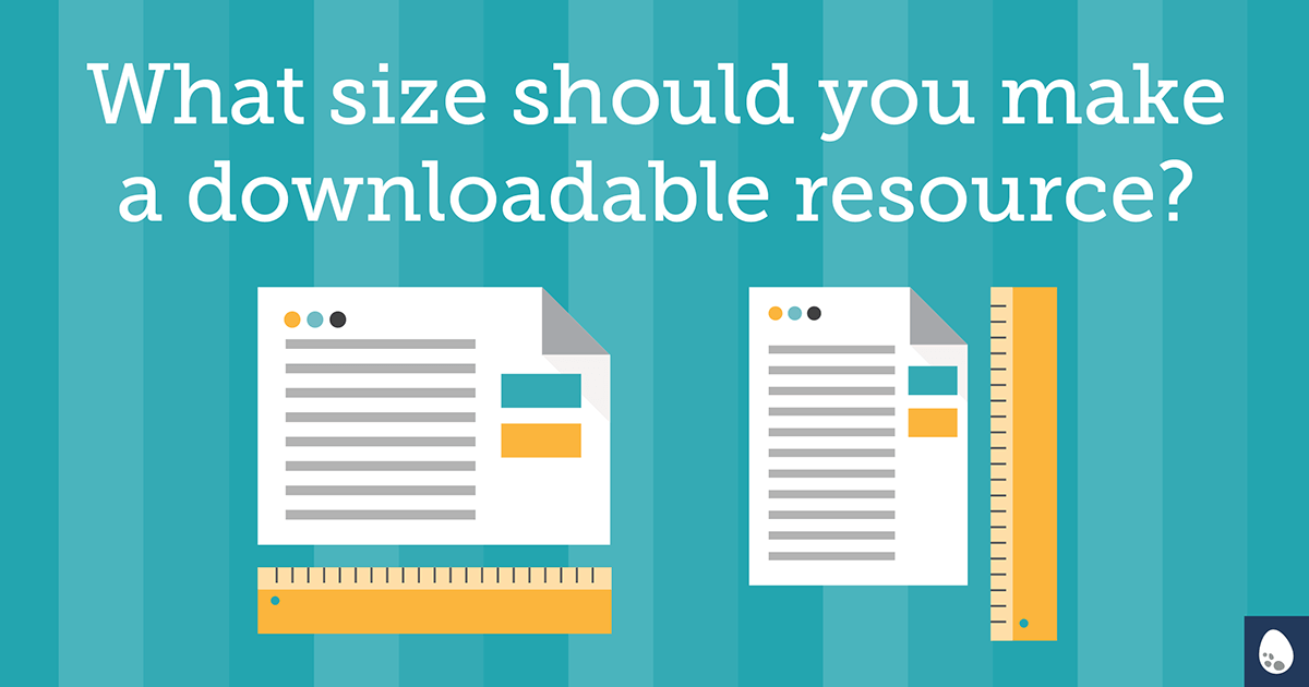
Guide, ebook, report, white paper, cheat sheet … these are just some of the many types of downloadable content your organization may be sharing online. But how do you decide what size will best suit your resource?
There are two options I typically consider at the start of a resource project. Which will work better depends on the type of content, your organization, and your target audience.
Option 1: Standard letter size
If you think that your content is likely to be printed out—it’s short, or needs to be filled out, like a worksheet/checklist—then I recommend you stay with a standard size so you can maximize the full space of a regular printed page (8.5” x 11”).
It also may be a consideration if you have an older target audience who prefer reading a printed copy over an on-screen version.
Remember—if you intend for them to print it, make it as easy as possible; no odd sizes.
This format is best for:
- something you’re encouraging your audience to print
- traditional collateral (i.e. white paper)
- when targeting an older demographic
Option 2: Optimize it for tablet
For longer reads, I usually recommend formatting for tablets. I typically use iPad dimensions ( 1024 x 768 pixels), since, at the time of writing, it’s still the best-selling tablet. The proportions are not far off from letter size paper—it’s just slightly taller (or wider, depending on the orientation). This means it’s still printer-friendly since most of the paper is being utilized.
This format is best for:
- longer documents: guides; reports; and ebooks
What’s the best orientation — tall or wide?
For a more traditional piece, like a white paper, often times clients like to stick with the status quo and go with a portrait (tall) layout. If it’s something that will be printed, portrait is your best bet.
For most other resources, though, I prefer a landscape (wide) orientation. Why?
Has this ever happened to you?
You open a PDF in Adobe Acrobat. Your vision isn’t what it used to be, so you zoom in to read the content. Now that the full page is no longer visible on screen, you scroll down to read the text at the bottom of the page. You scroll just a little too far and suddenly it jumps to the next page before you get a chance to read it all. Then you flip back and try it again.
Maybe it’s an annoyance I suffer alone, but I have a feeling some of you have also felt that frustration.
With a wider layout (landscape), you can view the full page on the screen at once. In order to make it a truly delightful on-screen reading experience, I suggest going with a larger font size than what would normally be used on a printed piece. The goal is to make it as easy to read on screen and avoid zooming in and out.
If your document includes a lot of callouts or images, landscape also provides more room to include an extra column for sidebar content without making the main body text feel crowded.

By considering how you want your resource used and who your audience is, you’ll be able to select a size that helps make your content a success. A reader is not likely to notice you made a good formatting decision but you can bet they’ll notice when you’ve made a poor choice.
