With limited attention spans and always feeling short on time, most of us don’t take the time to fully read a document or report. There are exceptions to the rule of course – those times when we can’t afford to skim the details (think an insurance policy or studying for a test).
But in most cases, we tend to scan for the highlights and the content that’s relevant to us rather than read something cover to cover. It’s not just lengthy documents we scan; I doubt you’ll read this short post word for word. I’m not upset – I get it.
So what can be done?
While we can’t force people to read something in its entirety, we can work with our reader to help them get the most from the text. By making your publication easy for them to navigate and by highlighting key points, they’ll be able to grasp the overall message even when just scanning through it.
I’m not going to delve into the nuances of writing style or general design best practices right now, but I will give you a few pointers that can help to improve the “scan-ability” (fake word alert) of your book or report.
1. Divide it up
If there’s a logical way to split up your document, do it. Separate it into sections, chapters, by theme – whatever makes sense for the content. This will help with navigation and scanning. If it’s a long document, provide a table of contents.
If space allows, begin sections on a new page to show a clear starting point. For long documents, you may also want to include a footer that lists the sections.
2. Establish a hierarchy
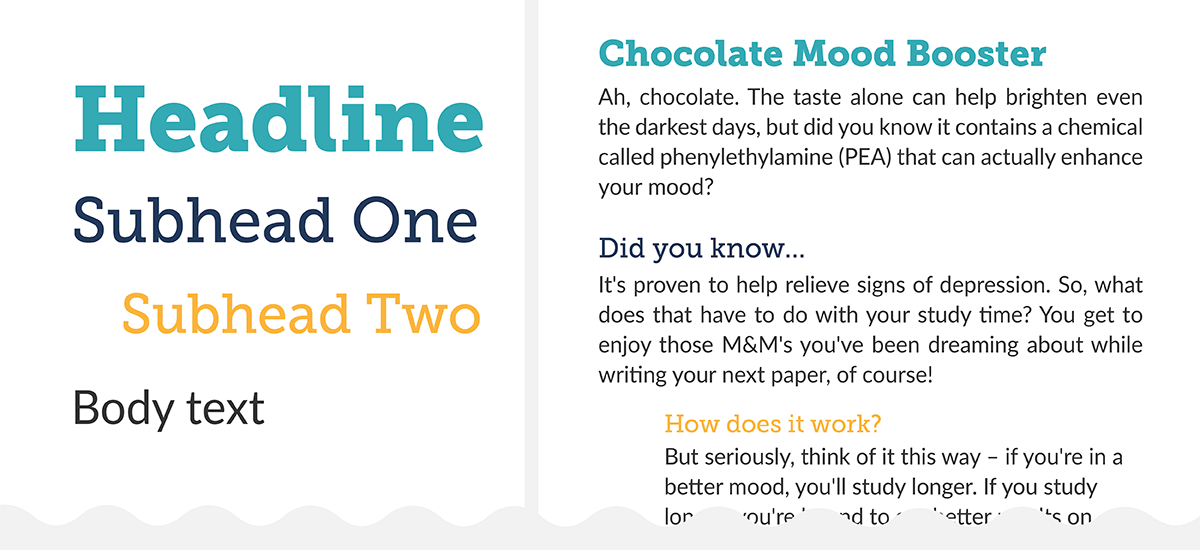
This is THE MOST IMPORTANT tip. Differentiating the headlines and subheads from the main content are critical to the “scanning reader”. It shows where the sections start and what content is related (aka subsections).
Based on tip 1, determine how many sections/subsections are needed. Choose a font (and yes it can and probably should be different from the main text font). HINT: If you have a lot of section levels, it’s a good idea to select a font that comes in a variety of weights (ie: bold, regular, light).
Starting from the lowest section level, decide how you want to format it. The font size should not be smaller than the body text. If it is the same size, differentiate it from the body text by either bolding it, changing the colour etc.
Don’t go overboard with the changes though – one or two differences is plenty (ie: Subhead text that is 3 point sizes larger and blue. No need to also bold and italicize it too).
Then determine the formatting of the next level up. Again, don’t go too far with the number of changes; a larger font size may be all you need. Continue doing this until all levels are formatted from the lowest subsections to the main headlines, then apply them consistently throughout your document.
Keep in mind, indenting sub-sections can also become part of your formatting plan.
3. List it
Bulleted lists, numbered lists… anything that can be neatly represented in a list instead of rattled off in a paragraph will command much more attention. Consider indenting the list if the page is quite text heavy.
4. Large lead-in paragraphs
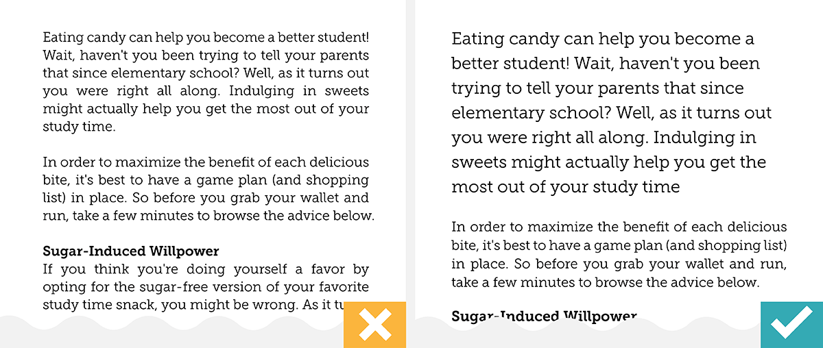
Help a “scanner” out and make the text in the opening paragraph larger than the body text. Several points larger is best. Reading that overview paragraph will let them know if the content that follows is what they’re looking for.
5. Call it out
Similar to increasing the size of the lead-in paragraph text, use larger font sizes to highlight key phrases for the reader.
A callout could be:
• separated into its own paragraph (with a font that differs from the body text)
• text found in the main content and then repeated in a ‘big way’ elsewhere on the page
Graphic elements can be used add some pizazz to your callout. Consider placing it in a shape or adding oversized quotations marks (only if they make sense, of course).
The key here is to keep the callouts short and interesting. Ideally, use a single sentence or abbreviate a long sentence. Or maybe it’s not a sentence at all but an interesting stat – see the next point.
6. Add a dash of infographics
Have a key point, interesting stat, or important process you want your readers to grasp? Use an infographic. People will always be more drawn to an image over text. The best infographics can be more than just eye candy – they can present a concept in a beautifully simplified way.
You can find several build-your-own infographic options online (some are free, some are subscription based). Tread lightly though. Owning the tools doesn’t always mean you know the most effective way to use them and you don’t want to end up with a junky infographic. Don’t be discouraged though. Start small. Stick to creating basic concepts, like facts and figures.
When it comes to processes and diagrams, it’s probably best to get an expert get involved. Not only will they have the experience to help distill your concept but can create a graphic that’s customized to your organization’s brand. That’s one of the limitations with online software – you’re often at the mercy of their graphics library.
By deploying some (or all) of these formatting and design tactics, you’ll give your reader the gift of easy page scanning and have more control over what information they take away from your publication. Win-Win.
So you’ve made it to the end after all? Now be honest, did you just skim through until your eyes landed here? 🙂
For more tips and tactics on report design, download the Make Your Research Shine PDF eBook. It’s free!


